About this Project
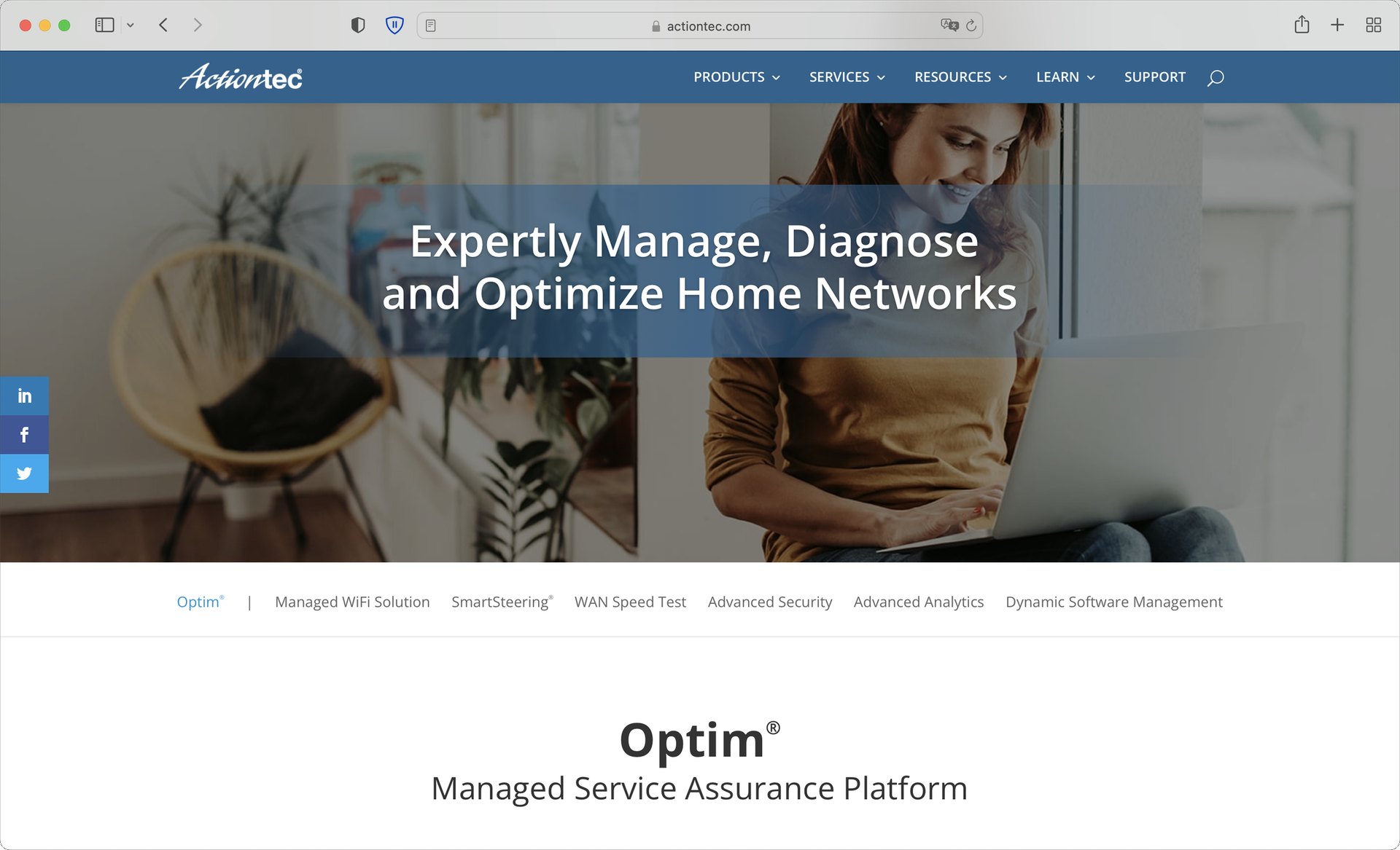
Optim is an ongoing project, and the product I have designed for since joining Actiontec in 2020. For years it was shaped around whichever client we were working with at the time — each release answering that client’s own needs. As Actiontec turned it into a platform, the work shifted: design that is general, premium, and able to serve clients with very different needs from the same product.
This page follows that shift through three chapters: a refresh of the most visited page, a component library to hold the product together, and Optim 6 — the redesign for a new era.
Process
The following illustrates the process I went through for this project:
Define
Learn
Design
Build
Validate
Nov 2020 Framed the Technician Dashboard, the most visited page, as the first to redesign.
Audited Equipment Details for look and feel, interaction, and hierarchy.
Re-laid the page in three sizes; colour for state, tabs for scattered data.
Micro-interactions and feedback for reboot and other destructive actions.
Jan 2022 Phase-one UI shipped; the new design carried into new features.
Refined from feedback after release.
Studied Material, Carbon, Ant and Apple’s guidelines; chose Material as the base.
Placed Optim’s tone on a style map: technical, plain, monochrome.
Atomic components, colour palette and themes, file covers.
A naming rule bound to design tokens.
Handover documentation for every component.
Tested inside features with developers, PMs and technicians.
Jun 2026 Sketched the service flows as clickable pages.
Jul Prototyped the network page and wrote its functional spec.
Jul Mapped identity and access for every role.
Aug Checked every screen against the 41 MVP requirements.
Aug Wireframes, the health-score model and the role model.
Sep Hi-fidelity mockups on a design system written as rules.
Sep Specs handed over for people and for AI agents, from one source.
Iteration 1
Optim — the progressive UI refresh
Overview
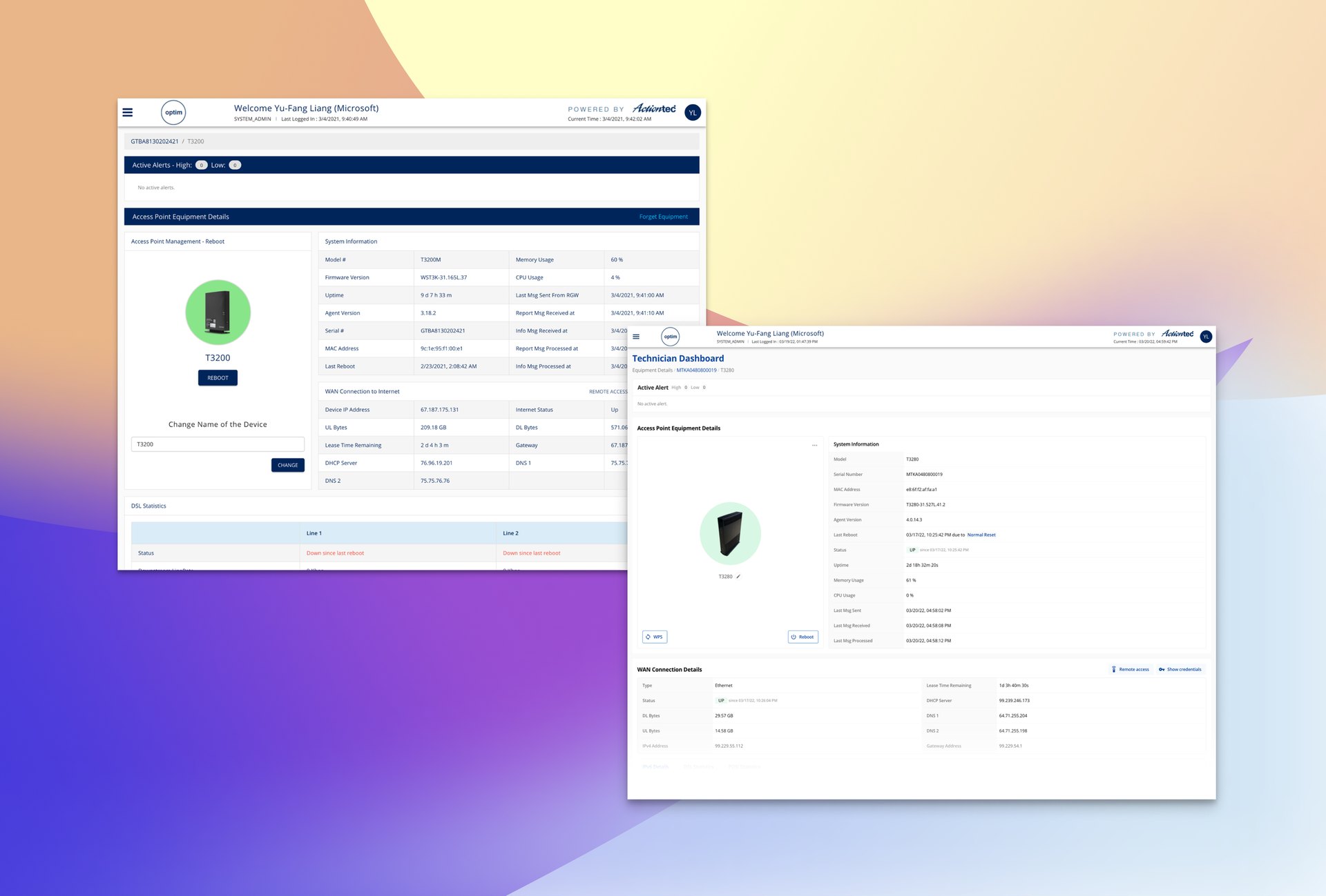
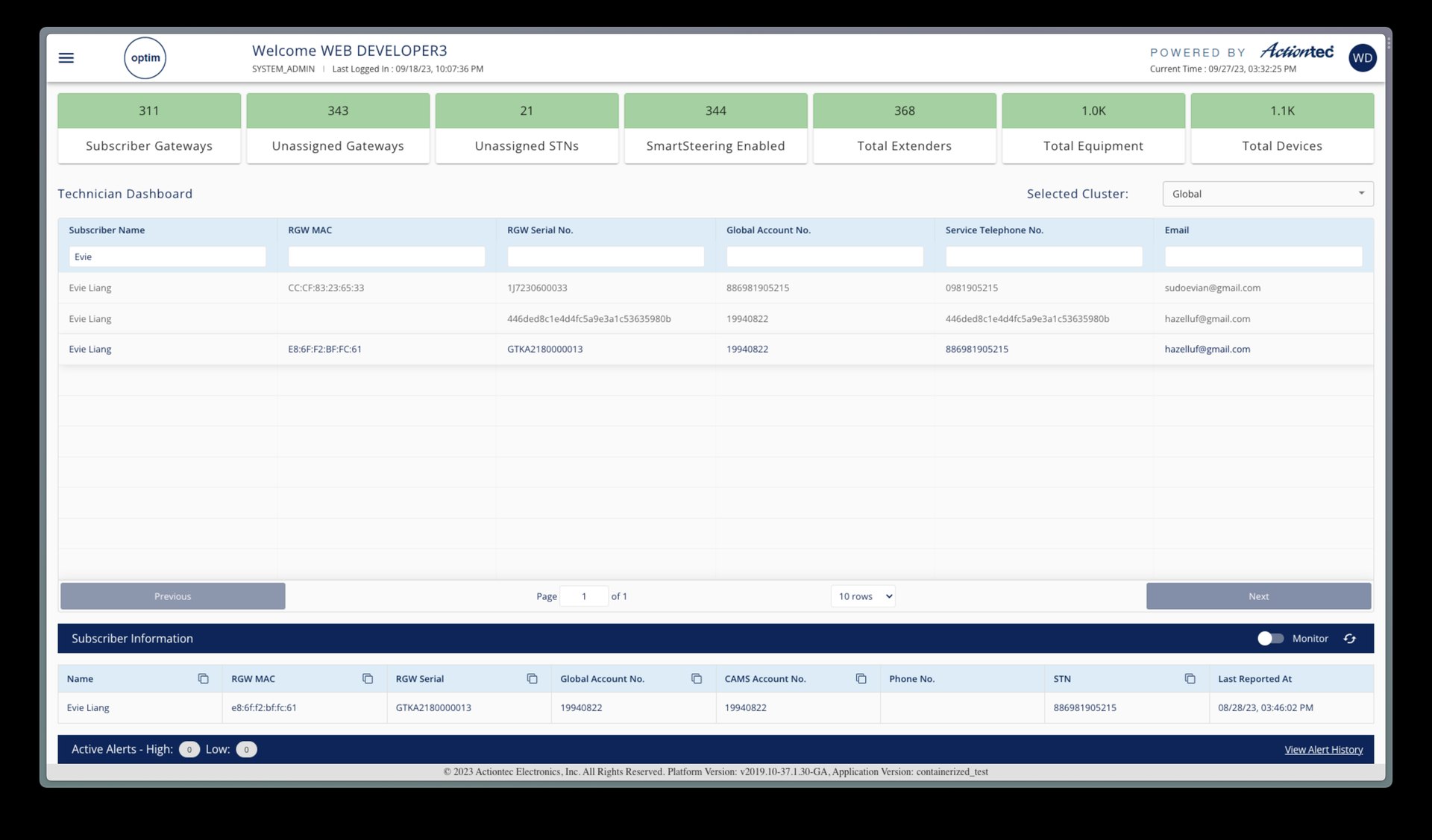
At the same time that a new style guideline is in progress, Optim also has a couple of things to overhaul. Technician Dashboard, particularly, is the most visited page of Optim, where users come to troubleshoot, look up for clients’ data and statistics, and operate different kinds of configurations at individual and/or system levels.
Time
2020/11 - 2022/1 (Phase one UI updates)
Handled Tasks
- Incubation
- Defining product scope
- Sprint facilitation
- Prototyping & motion studies
- Stakeholder presentations
- Documentation
- Testing (A/B, integration, usability)
Challenges
There are three key areas Optim Equipment Details Dashboard (short in ED dashboard) might improve:
Look and feel
with a few changes, the ED Dashboard can still feel powerful, but more approachable and organized. It can retain its utilitarian aesthetic while being more forgiving of a user’s mistakes. And this page can use color and shape more effectively to guide attention, create a scannable interface, and help people immediately identify their current state and the next step to take.
Interaction design
there are many places where we can streamline interactions, provide clear feedback about the result of a given interaction, and in some cases remove certain interactions entirely to simplify the interface further.
Layout and hierarchy
key changes to the layout and visual hierarchy will make ED Dashboard easier to understand and navigate.
Major Observation
Optim Equipment Details Dashboard feels technical, utilitarian, sharp, and unforgiving.
Many interface elements are squeezed in a small area and positioned in a wired way. Also, using the same weight font for almost everything in a table provides more density at cost of scalability and difficulty of understanding the information. Buttons, element positions, font weights, and color, trading a requirement for high user concentration with the ability to understand a lot of information in one page.
With the constraint of the minimum change that won’t affect the current user habit, the most important thing I started from is to rearrange the layout and refine the interaction.
VISUAL
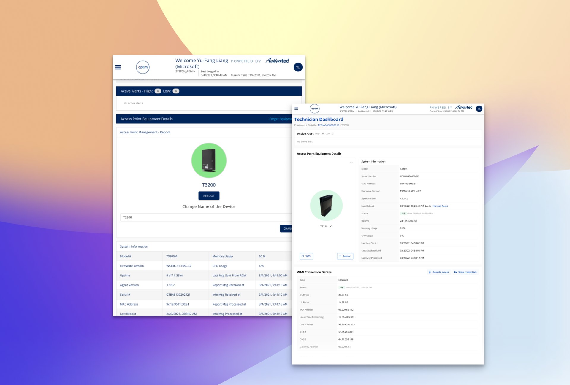
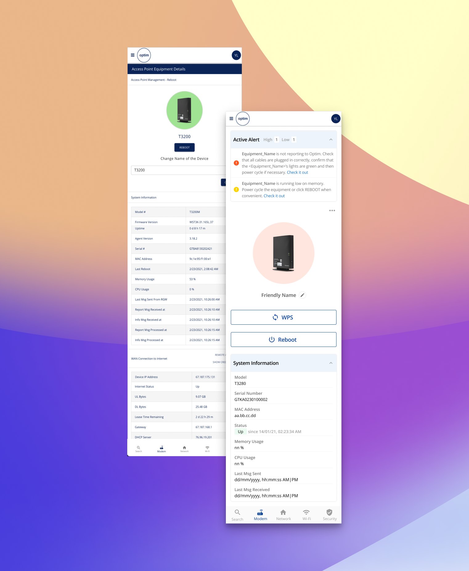
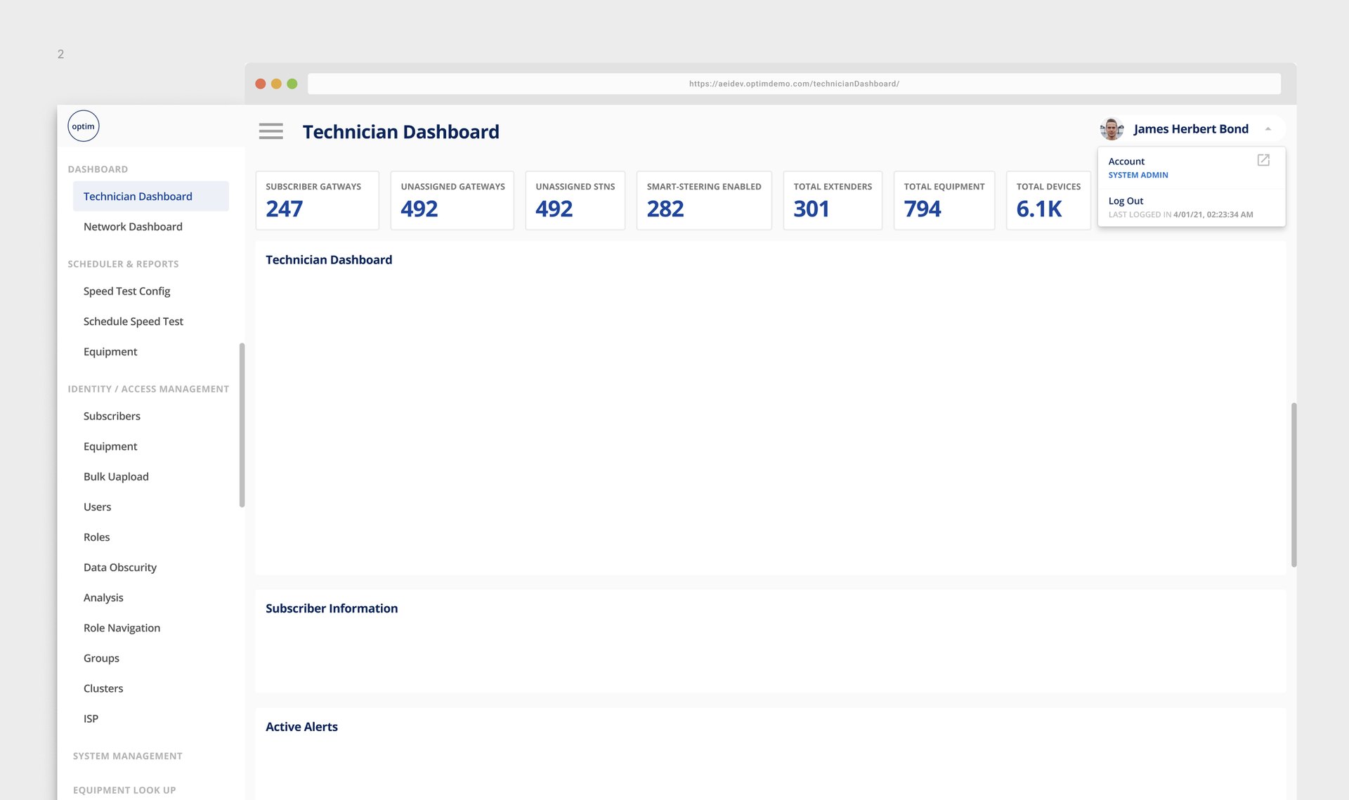
- Use color to better distinguish interactive and destructive interface elements. Deep orange is signaling for attention, light blue is interactive, gray is disabled.
- Improve the action state by color and mini-interaction.
- Reorganize the table column and row, add tabs to categorize data that was going to be scattered all over the place.
INTERACTION
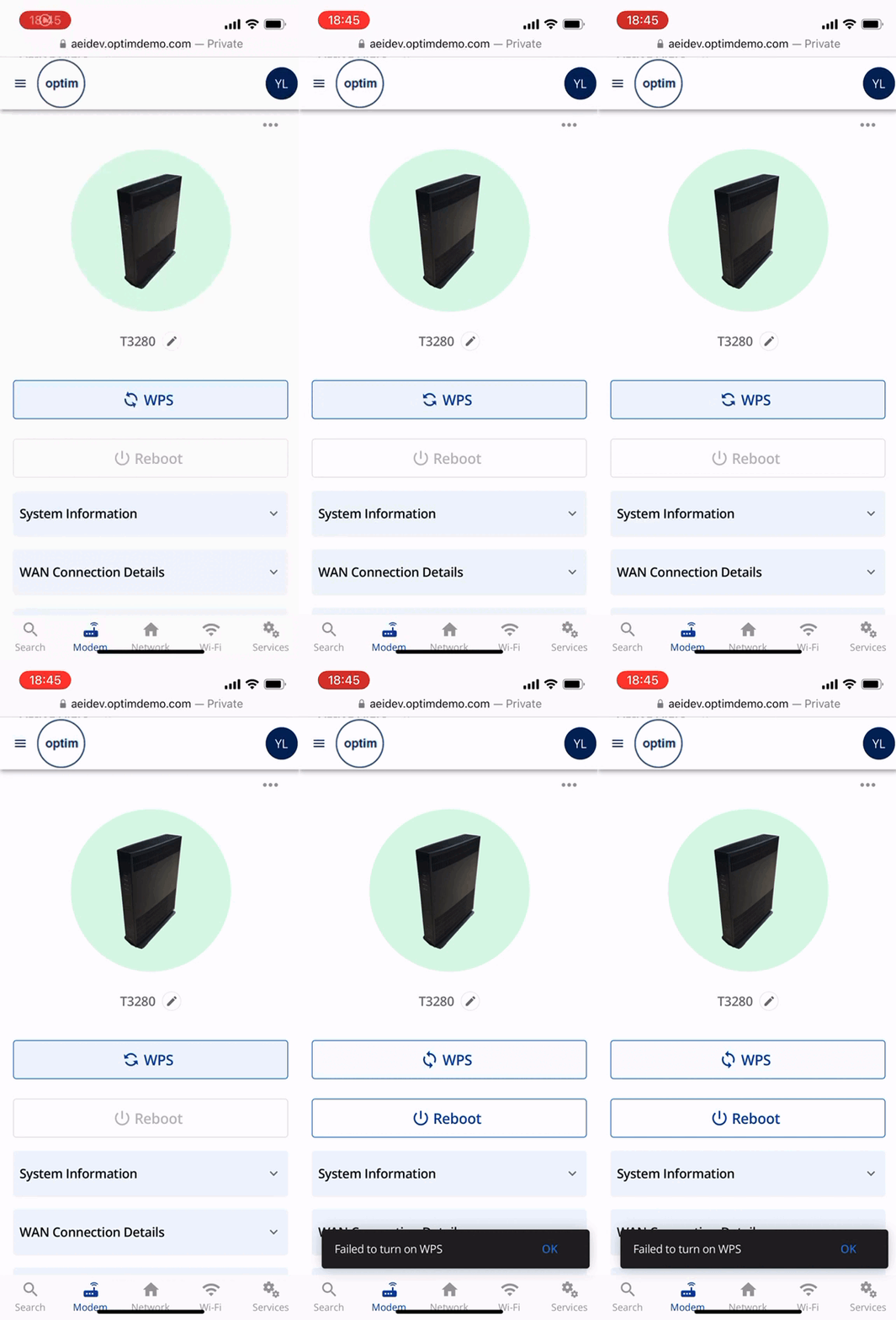
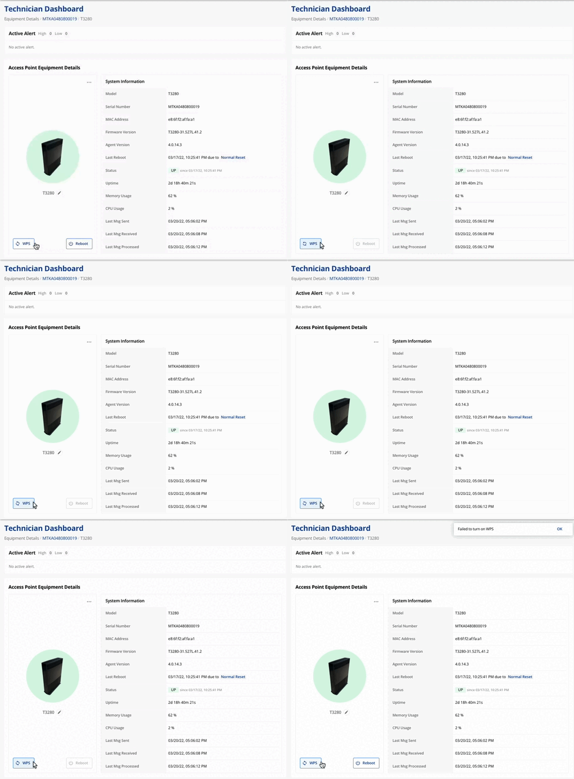
- Simplify the prompt process of destructive actions(excluding actions that are “semi-destructive” like resetting configurations), like rebooting equipment (confirmation and operation state toast).
- Considering looking at it on a smaller device, prevent the in-table and whole page horizontal scrolling.
- Provide feedback to users when interactions cause changes to happen out of view.
For example, trigger the Reboot button → confirm to proceed with the action → waiting for the process to get started → waiting for the action result. The user would need to be notified of the outcome of each step that keeps him waiting.
Other Problems
- In the CPE config management page
Many interactions require too many clicks or steps when they could be streamlined or removed entirely. - The entire application should be clearly communicated at all times.
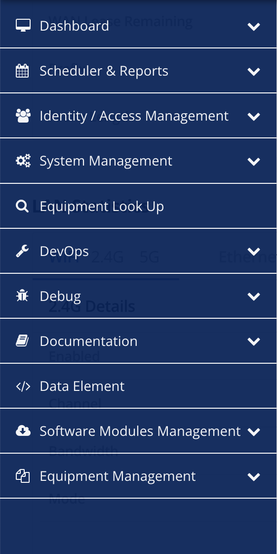
- The common app functionality is spread apart, making it unintuitive to know where to look for certain controls. For example, the feature naming:
- Dashboard
This whole site is actually a big dashboard, and what I know about this page is actually a subscriber’s collection library - Scheduler & Reports
What scheduler and report specifically? Or should we even separate these two features? - DevOps
Does it stand for Development Operations or something else? How to tell the users what service it provides through this name? - Equipment Look-up
There is literally just a search input after I enter this feature. After learning more about what it is about, I got it. But as a standalone feature? :/ I wonder if this be integrated into other pages like the Technician Dashboard.
etc.
Recommendation
We could group common functionality in many ways, but a more grouping might be:
- Core functionality (config + stats e.g. Equipment Dashboard, Software Module Dashboard)
- User information (profile, settings − including theme selection, log out, etc)
- Secondary functionality(DevOps, Debug, Documentation)
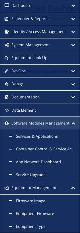
- Within the Technician Dashboard aka the Homepage, we can simplify the layout, considering:
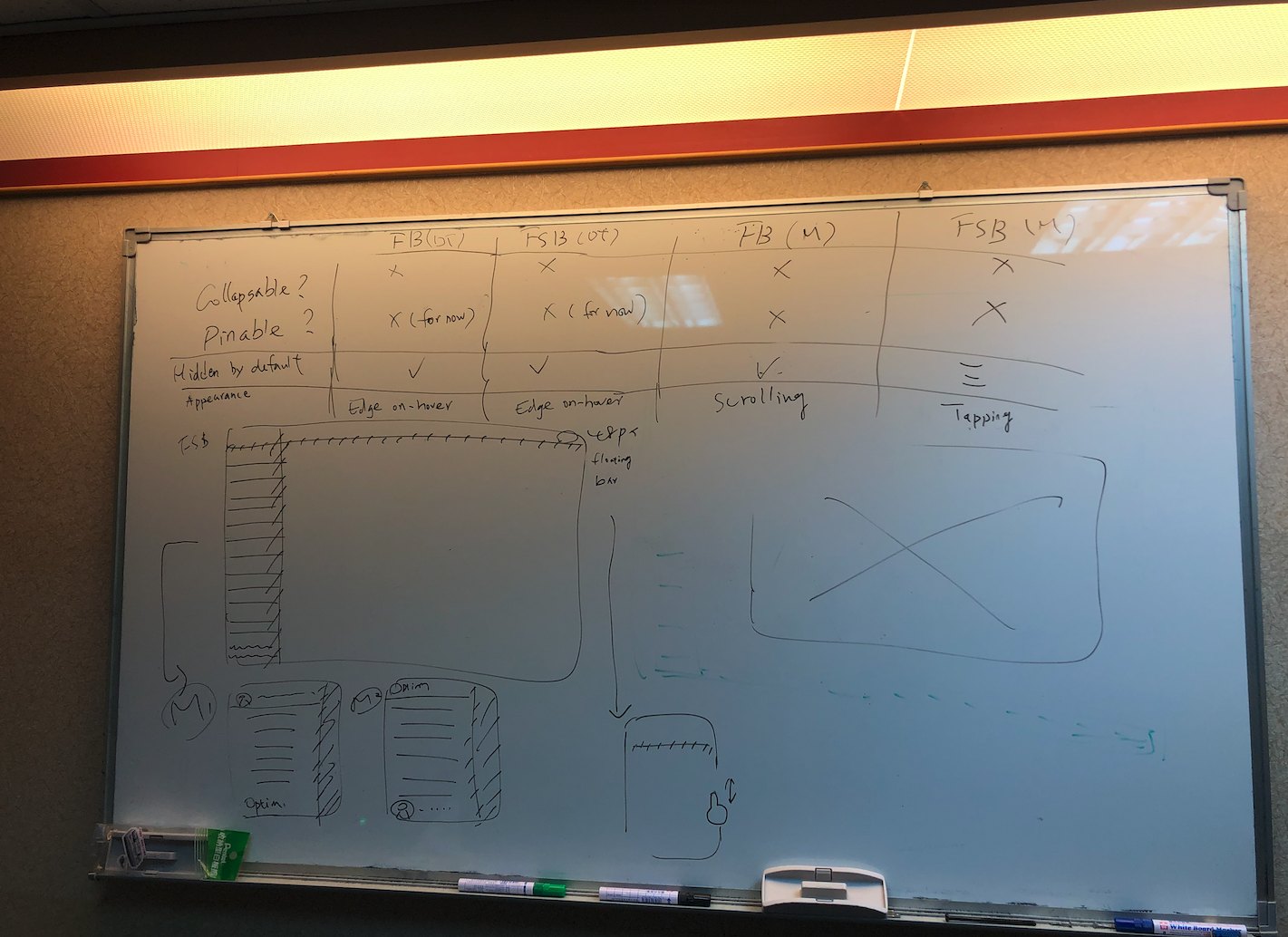
- using an expandable-collapsable layer or sheet to make the section hierarchy more distinguish
- try subscriber info - CPE info - Network info
- removing all extraneous controls/information that doesn’t fit neatly into the particular user flow.
For example, the global banner containing the username, login role, login time, and current time may not need to be displayed as part of persistent information - The information contained in Equipment Look Up is totally contained in the Equipment Details page.
- improving the visual consistency. Elements vary across functions and pages, which increases the effort to learn and adapt to differences when switching between screens.
Functionality
Optim Dashboard is made up of many small projects. Aside from the problems of aesthetics, accessibility, and usability, functionality is almost always the first thing to work on. Every feature plays a role in the system, and each of the requirements, as the user needs, may find itself developing the user flow dozens of paths to go. Relevant features and any interconnected actions all need to be considered to proceed with the design afterward.
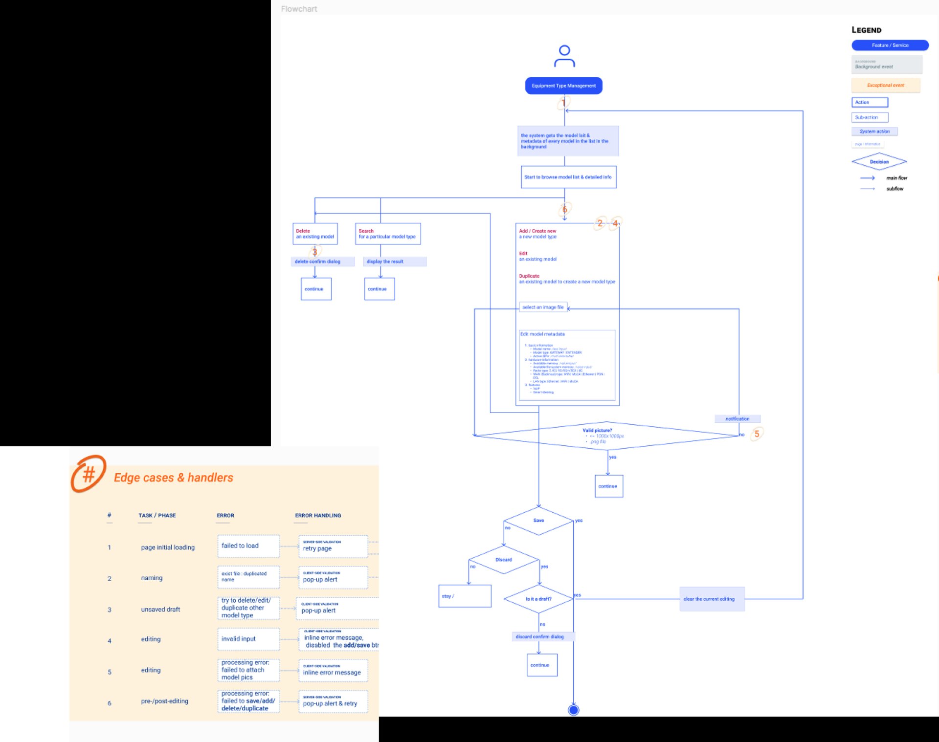
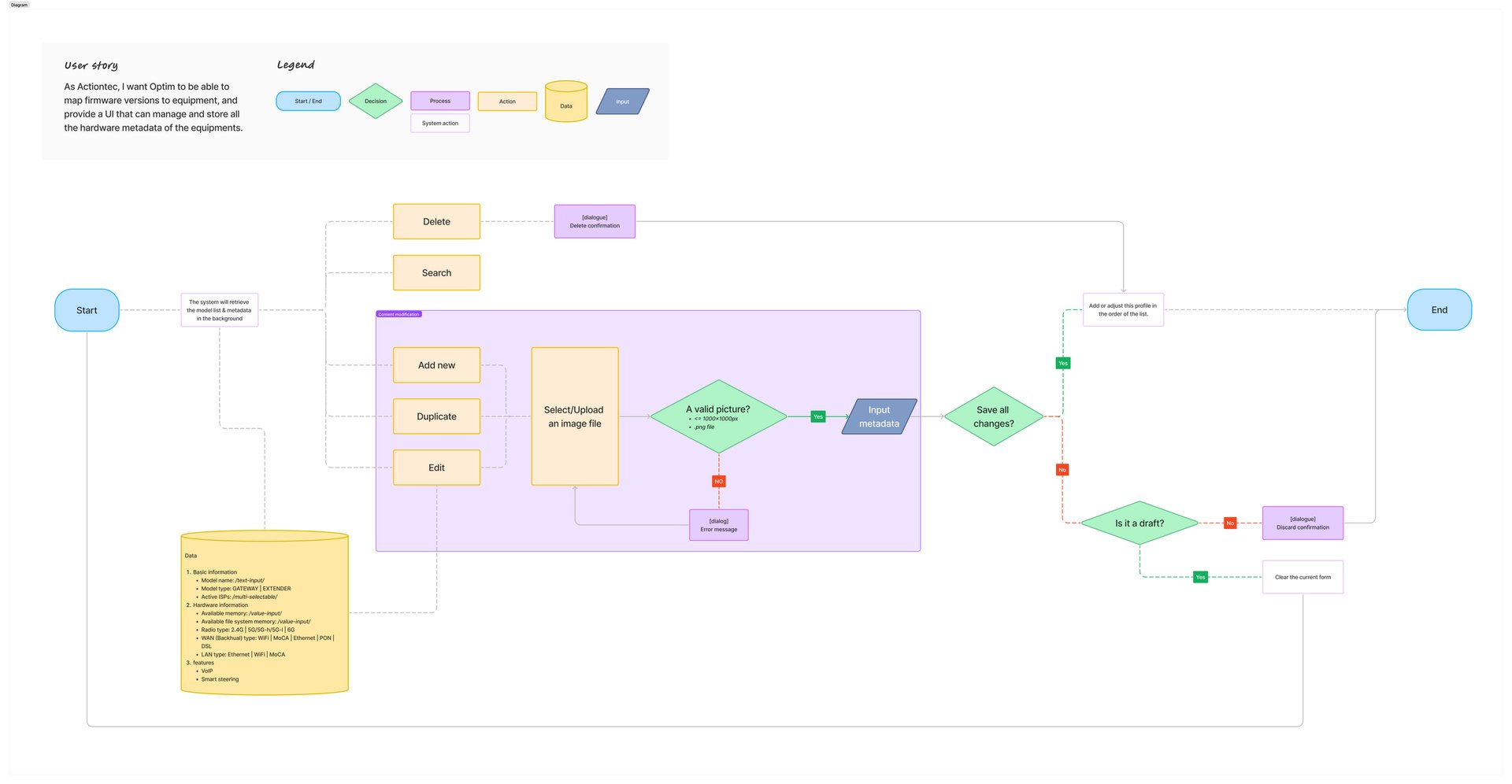
Takeaway
The good part
Despite a lot of compromise being made, there is still room to improve the workflow within the team. Being the only designer of a hardware-centered organization, things like clarifying the requirements, evaluating the usability, interactions, interfaces and workflow of every feature that requires me a while of time to deal with without a little solid foundation of understanding from the real users, I’d take it as a great chance to level up my more precise intuition to the user needs.
The less good part
As the infrastructure of design system is working in progress, the new feature requirements keeping coming is definitely a challenge to me. It’d be better to conduct this project as a team that PMs and developers can point out the feasibility issue or any potential needs before any decision is made. Also, with limited time resources, the testing plan wasn’t been conducted thoroughly. We applied new design to new features as an MVP and collected feedback after release. That is to say, iterations and migration inevitably progress slowly.
This to me is absolutely a fresh and humble experience to learn that
- working as a team, collaboration is the key
- designing at scale, test in detail.
Iteration 2
Optim Component Library
Overview
Optim is a cloud-based service that offers an Internet management platform for ISPs in the US, also a big project developed 2 years ago when Actiontec Electronics Inc. started to transform. Optim originally was developed with various frameworks such as Bootstrap, material design UI, and self-defined styles that as a whole consistency and usability need to be improved, I, therefore, was the lead designer to establish a design guideline for the desktop version when I joined the team.
Time 2021
Handled Tasks
- Product vision & strategy
- Defining design principles
- Brand research
Spot the problem
By the time I initially took on this project, Optim just looked like a creature that combined with limbs from various parents. That components in the same use case used in different ways caused a lot of confusion. As new features kept being added in, and most of them came with sophisticated requirements, the priority of the redesign became a trade-off.
So the challenge was, how might we do both at the same time?
Research
First of all, I needed to know how deep I would be diving in by the time when I actually get started.
So I conducted on the research of
- the design system across the most popular ones(Ant design, IBM Carbon Design, Material Design, Apple HIC, etc), Boostrap, Ant Design, IBM Carbon Design, Material Design and Apple HIC,
- each feature, the ambiguous design used in the current Optim version
I preliminarily take the idea of Material Design to be the core because of its style similarity with the production and the resource constraints. Communicate with the development team, we agreed on the compromise solution. Instead of rebuilding a brand new design system for Optim, I decided to tune the best practice based on the material design to fit with Optim’s character.
Choose an approach : Atom design + Iteration
Due to the new features being still in progress, components used in different features may not be considered and renovated as a whole, the front-end team decided to try atom design on our implementation, so that we could make sure that changes would cover the smallest elements.
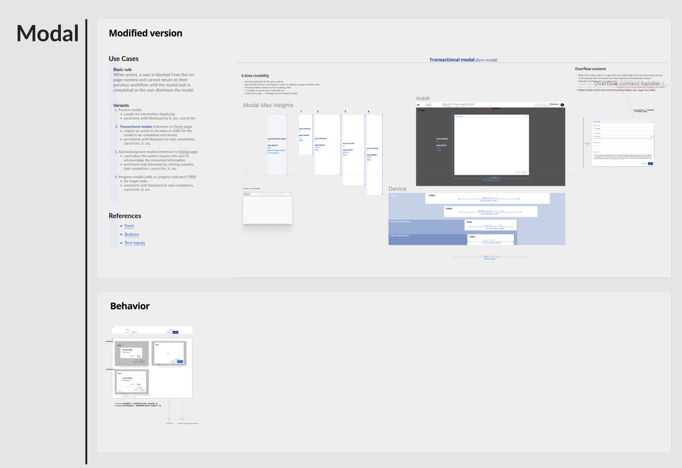
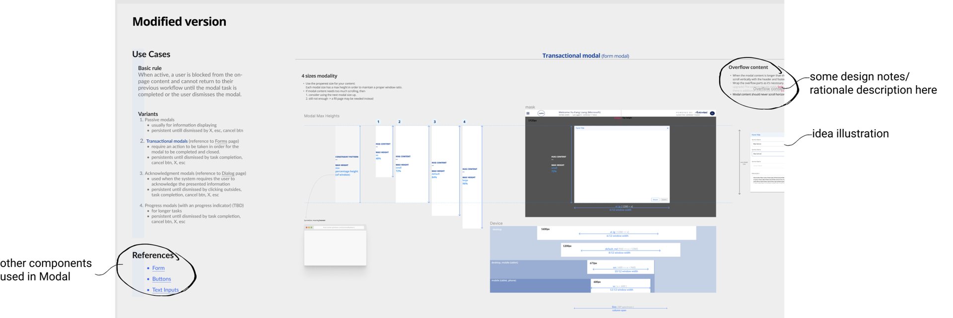
For example, in the first version of the Modal page, for example, I put all atoms together on one page.
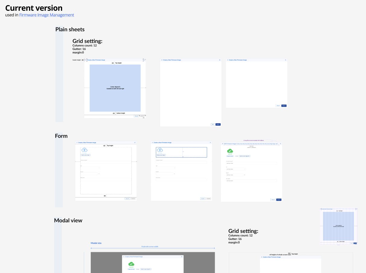
The modified version, I listed the use cases and types as well as the atoms contained in the component.Also, left some design comments at the corner just in case to show the idea in team discussion.
Define the tone
So, what’s Optim’s character feels like?
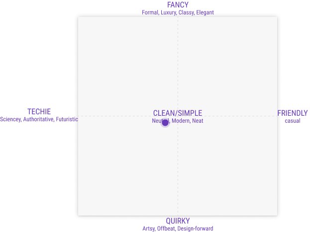
Optim’s current UI display was quite monochrome and text-formed; mixed typography in charts as well as list view, no color-distinguished alert mechanism, techie system message, and purely text-filled error pages which lead to a more techie but less fancy side on the style coordination diagram (upward).
Color Palette & Theme
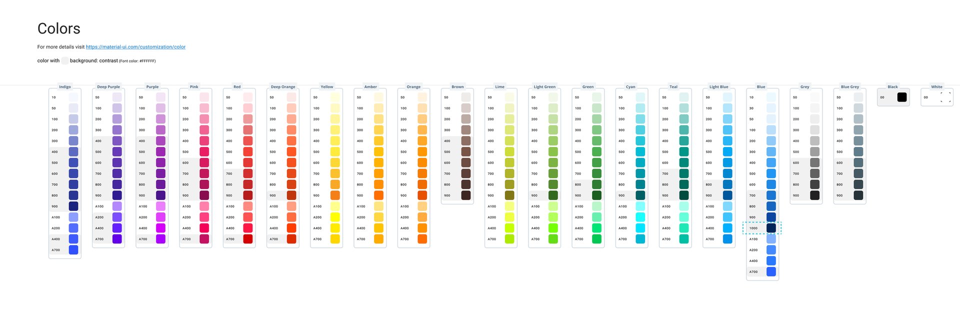
By the time I just joined the team, Optim’s messy color scheme triggered the idea of the reorganization and theming.
In this project, I did some exploration of the brand characteristics and defined the information architecture, also created a prototype page by device.
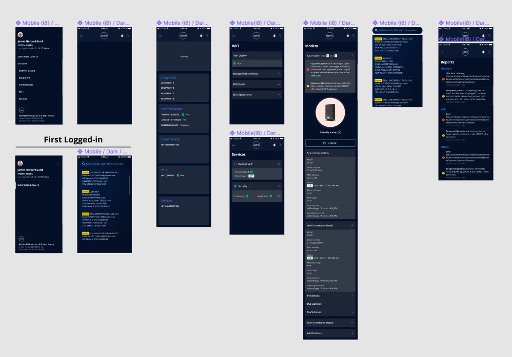
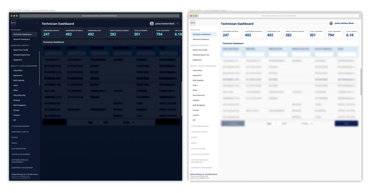
The Details
Cover
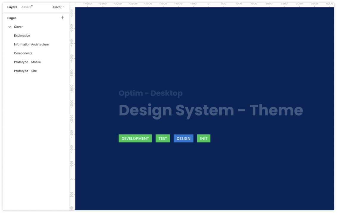
In the beginning, to set up the design system so that the file for each component and pattern has the same category. Also, to give a quick understanding of what design process a file was currently in, I added a status label enclosed in brackets to the file name. However, this didn’t make it more recognizable.
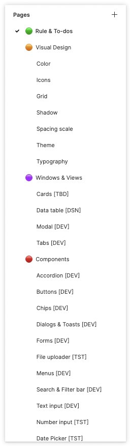
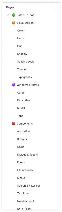
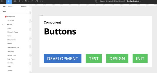
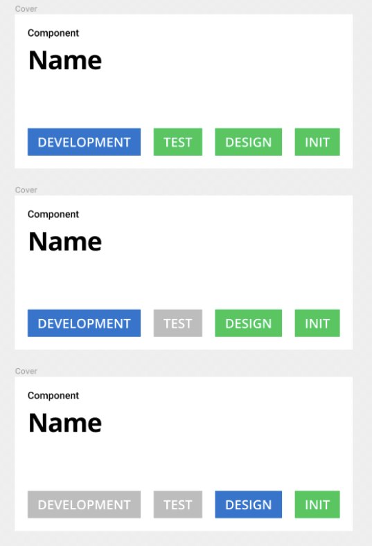
Besides removing [the progress label] from the pages title, I also made a cover for each file, which clearly shows what design state a component is in.
Naming Rule
Also, to better organize the new components and distinguish them from the old version, I defined the naming rule for each type of component along with a token(e.g. .state) , which make everything could be used in various use cases.
Coverage from wide to narrow, say, screen to component:
File name / Page name / Frame name / Component name (variation, style, type & state)
👉 One more thing - Token
I was thinking to bind the naming rule with token.
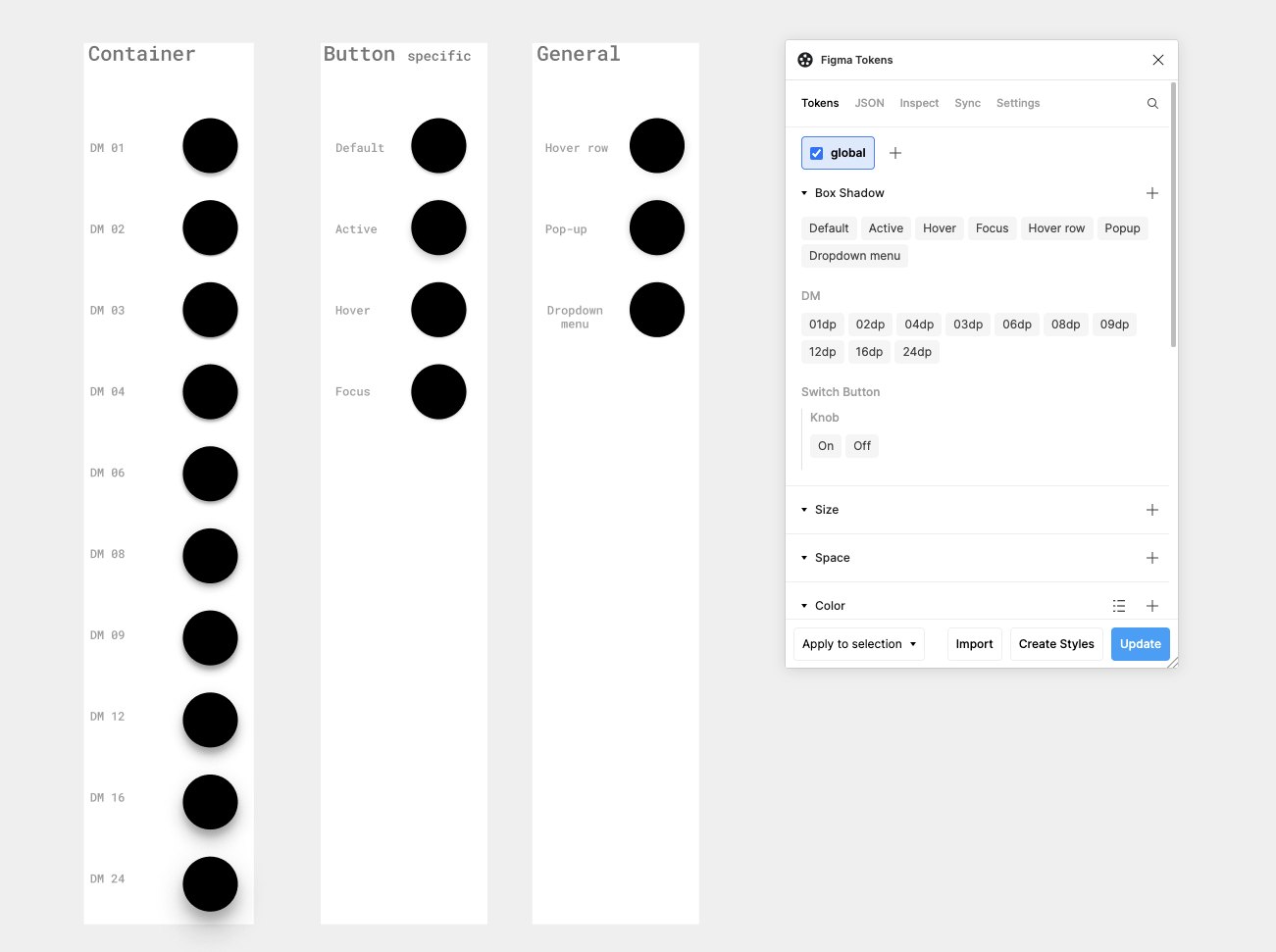
In the midway of the design, I found some Figma token plugins are really helpful in terms of reducing the communication cost between designers and developers.
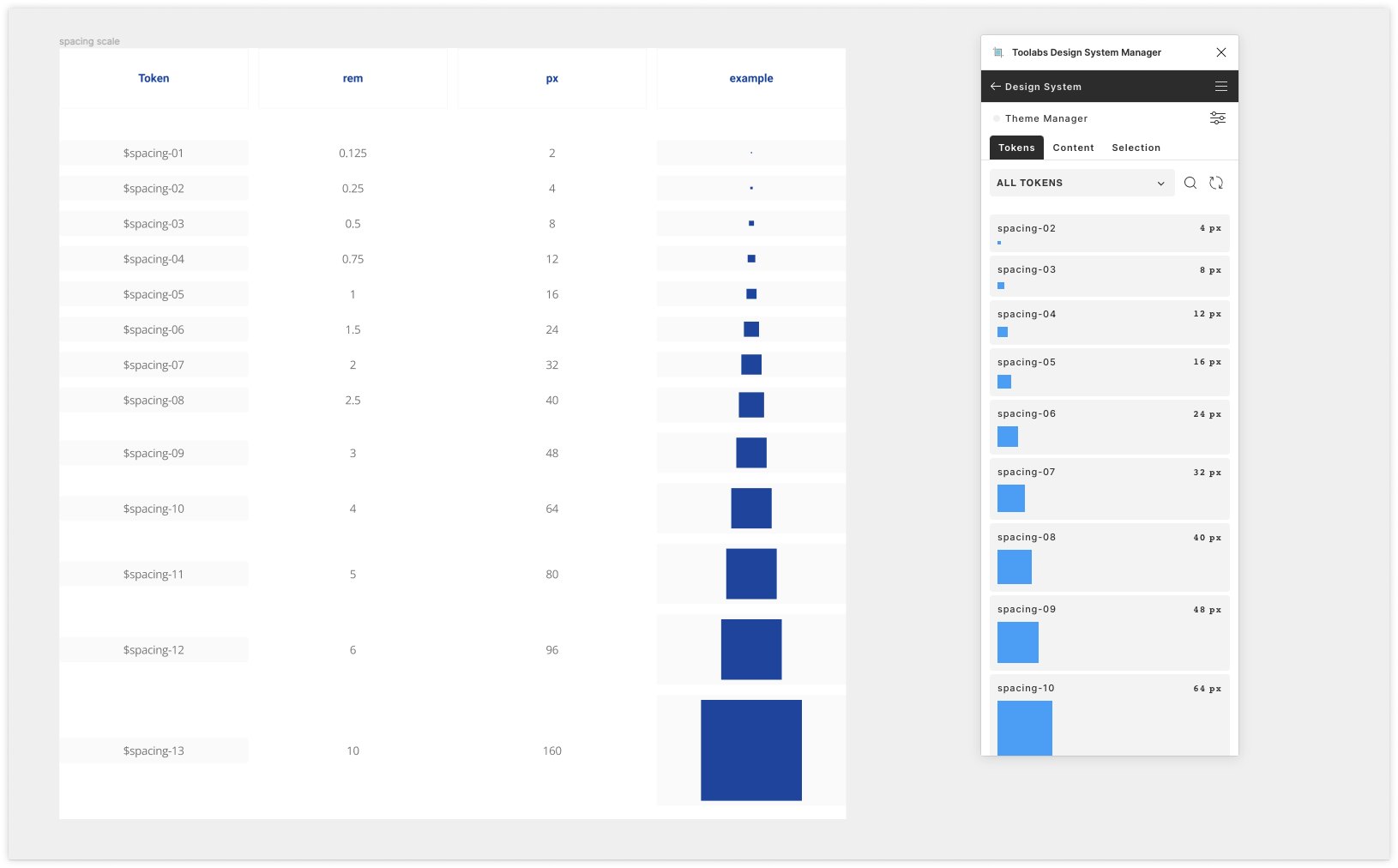
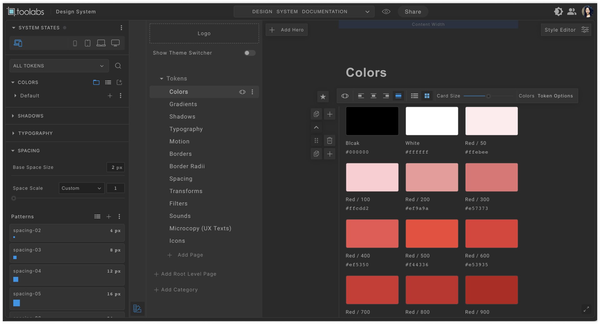
For example, Figma Token and Toolabs Design System Manager are the token plugins I really like.
In some cases when I am just testing a couple of ideas, it helps me define and update tokens in one single panel without going to the main component to adjust the design in Figma, and updating it to the library. In other cases that I already defined the specs and exported them to the library, the plugin can just bind them with the token I just created together.
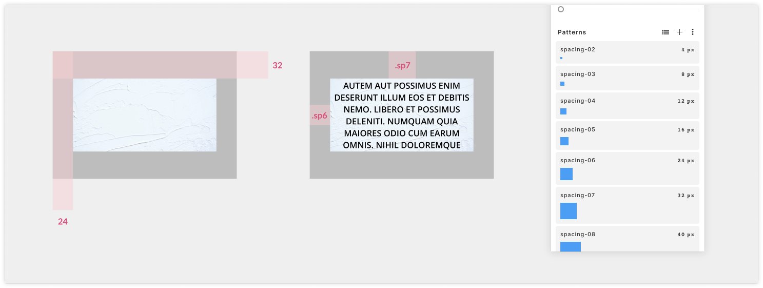
Take Spacing for example, I used to use Redline or even one-by-one manually to annotate the spacing between elements, with design tokens, it does save a lot of documentation time.
Some screenshots for example in the toggle list
Iteration - Test, test, test
Current strategy: Test in feature, follow the guideline.
- To know how the usability of each component being used appropriately, I conducted a series of testing steps by feature to get feedback from developers, PMs, and some technician users, yet the time and human resources are so limited that it ended up being just MVP.
Handover
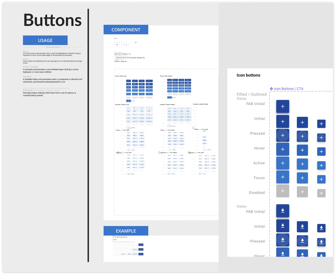
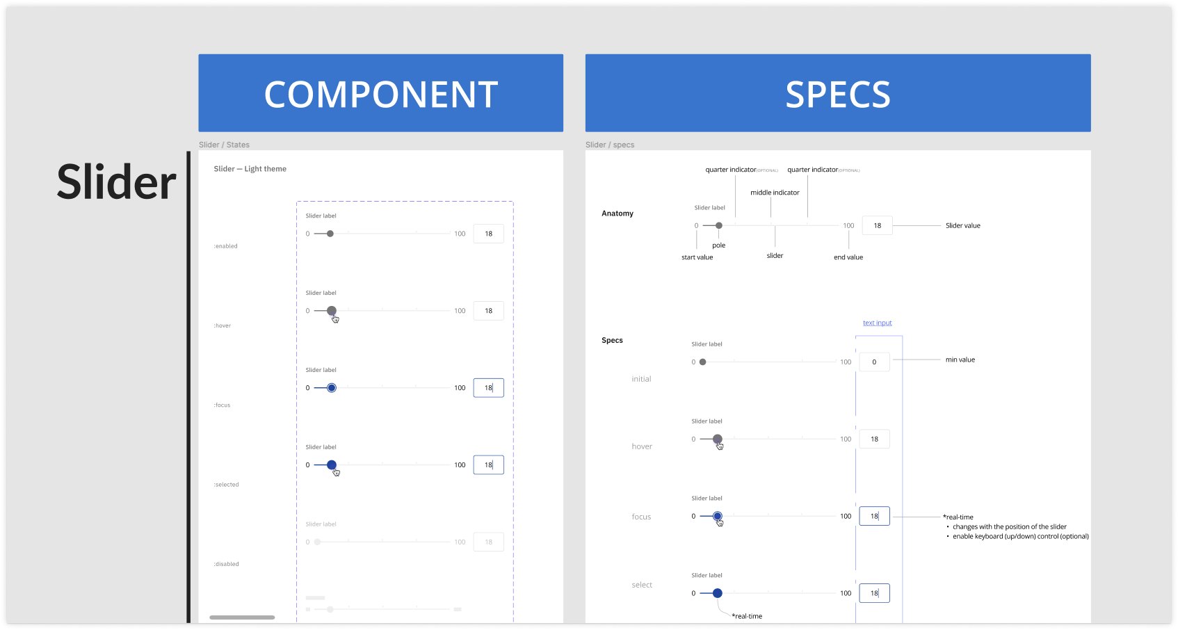
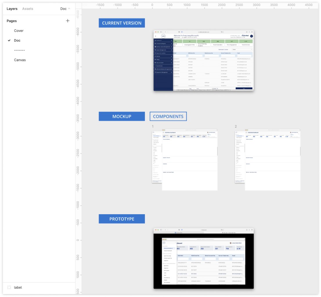
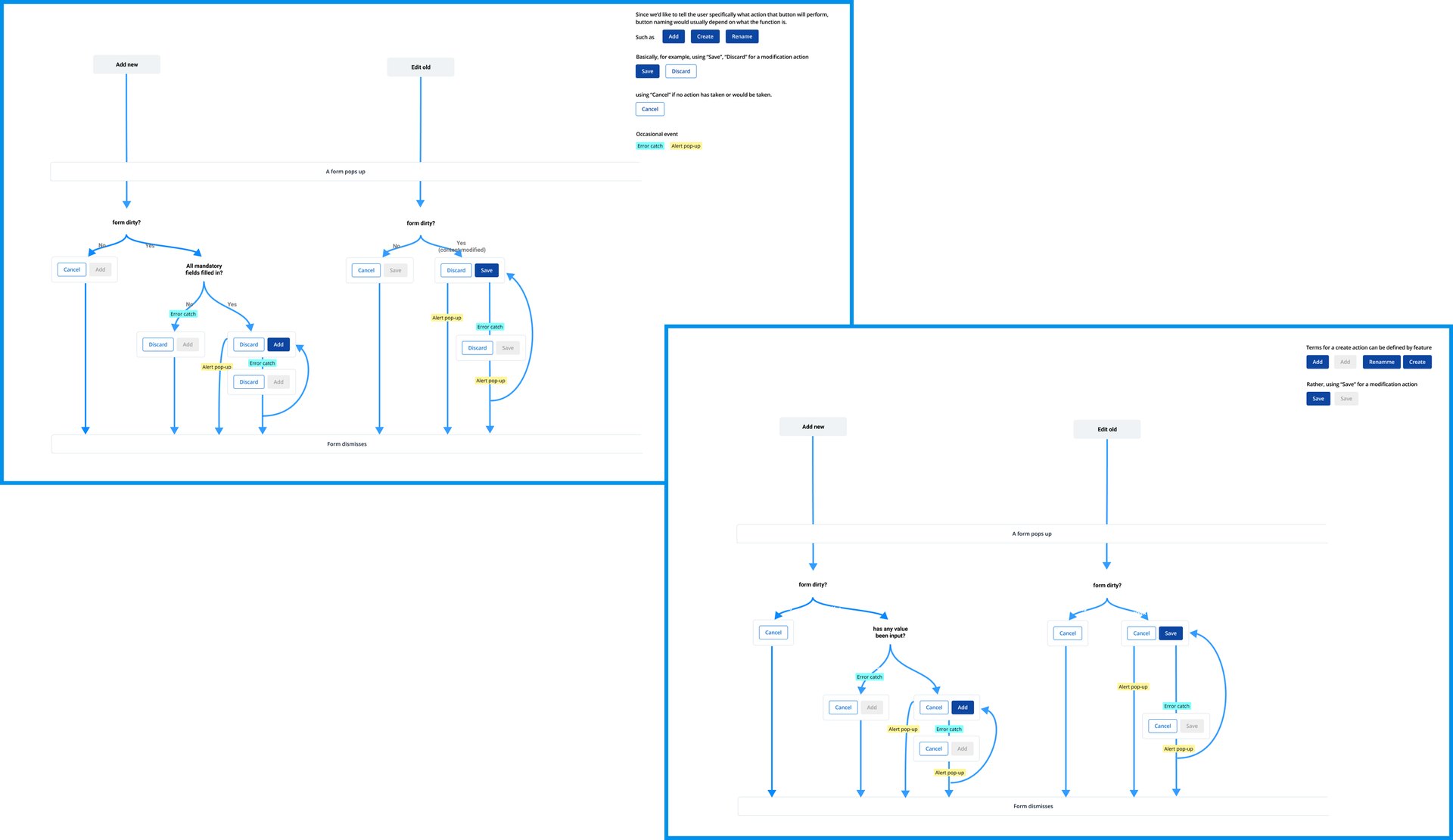
Documentation: for each component
- Types/Variants(behavior, use case, user flow),
- Formatting specs(anatomy, alignment, placement),
- Content,
- Related components(exchangeable cases)
- Prototype(interaction-focused)
Some screenshots for example below.
Future Forward - Systematize
Making a design system was the initial goal, at this point, it’s just more like an asset library with a style guideline.
To make it more a real system , there is some work we can move forward. Such as
- a more organized file structure
- pattern
- changelog
- branding style (currently we apply MUI quite a lot)
- accessibility
Takeaway
The art of being consistent yet flexible -
Unlike designing a standalone product where you have full control over the end-to-end experience and a clear scope at the beginning, designing a design system require taking care of the usability and audiences’ origin impression of the brand itself, also communicating with each party(the executives, marketing team, product team, etc) to get the consensus. As a result, when the requirement party had slightly different elements or interactive behavior based on their unique user needs or technical constraints, my goal was set to find that balance between consistency and customization.
Iteration 3
Optim 6
This iteration is private
Enter the password you were given to read it.
That password didn’t work.